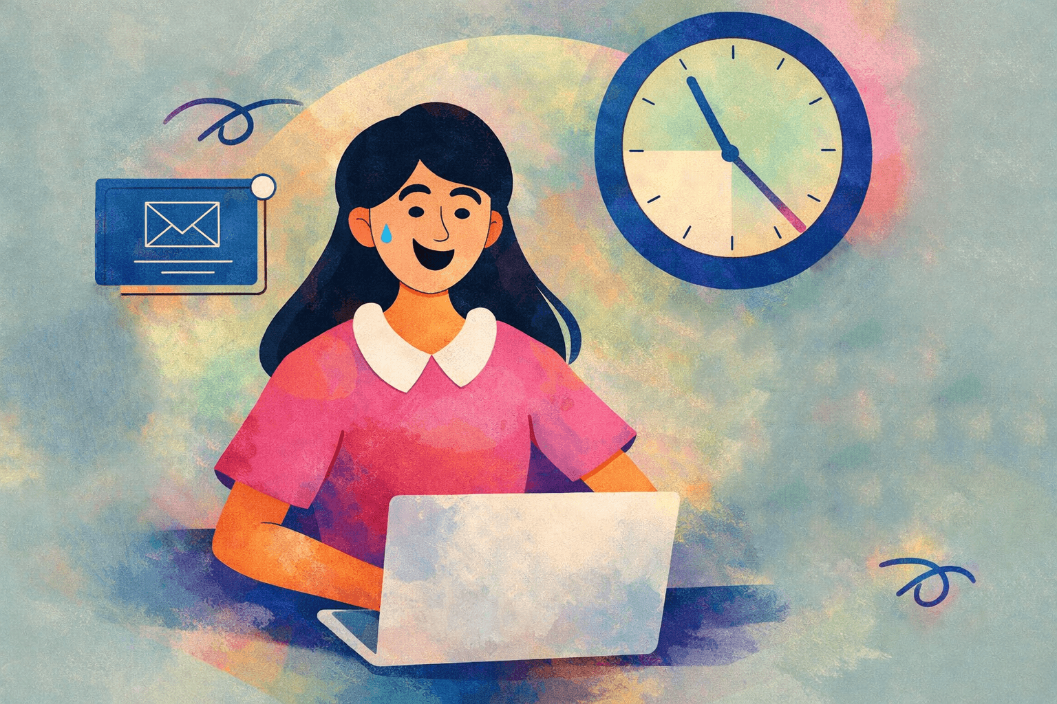
Short attention span doesn’t mean users became careless or stupid. It means they became overloaded. More tabs. More notifications. More products competing at the same time.
By the time a user opens your product, their attention is already partially spent.
So attention today isn’t weak — it’s scarce and expensive. And design decisions now directly decide how wisely we spend it..

Recently, I’ve been working on a product that seems simple on paper: a personal website for a medical cosmetologist who also sells professional courses.
A “site-business card”, nothing fancy.
As usual, while diving into the niche, I started reading research and best practices.
And I kept seeing the same recommendation again and again:
The first screen should not be an introduction.
It should sell.
That honestly surprised me.
Not because it sounded aggressive — but because it contradicted how many of us were taught to think about structure:
First — who you are. Then — what you do. Then — why it matters.
But users don’t wait for context anymore.
They scan. They decide. They leave.
The first screen is no longer an introduction.
The first screen is not a place to explain.
It’s a place to anchor attention.
If users don’t instantly understand:
where they are
what they can do here
why this is relevant right now
— they leave. Quietly. Without feedback.
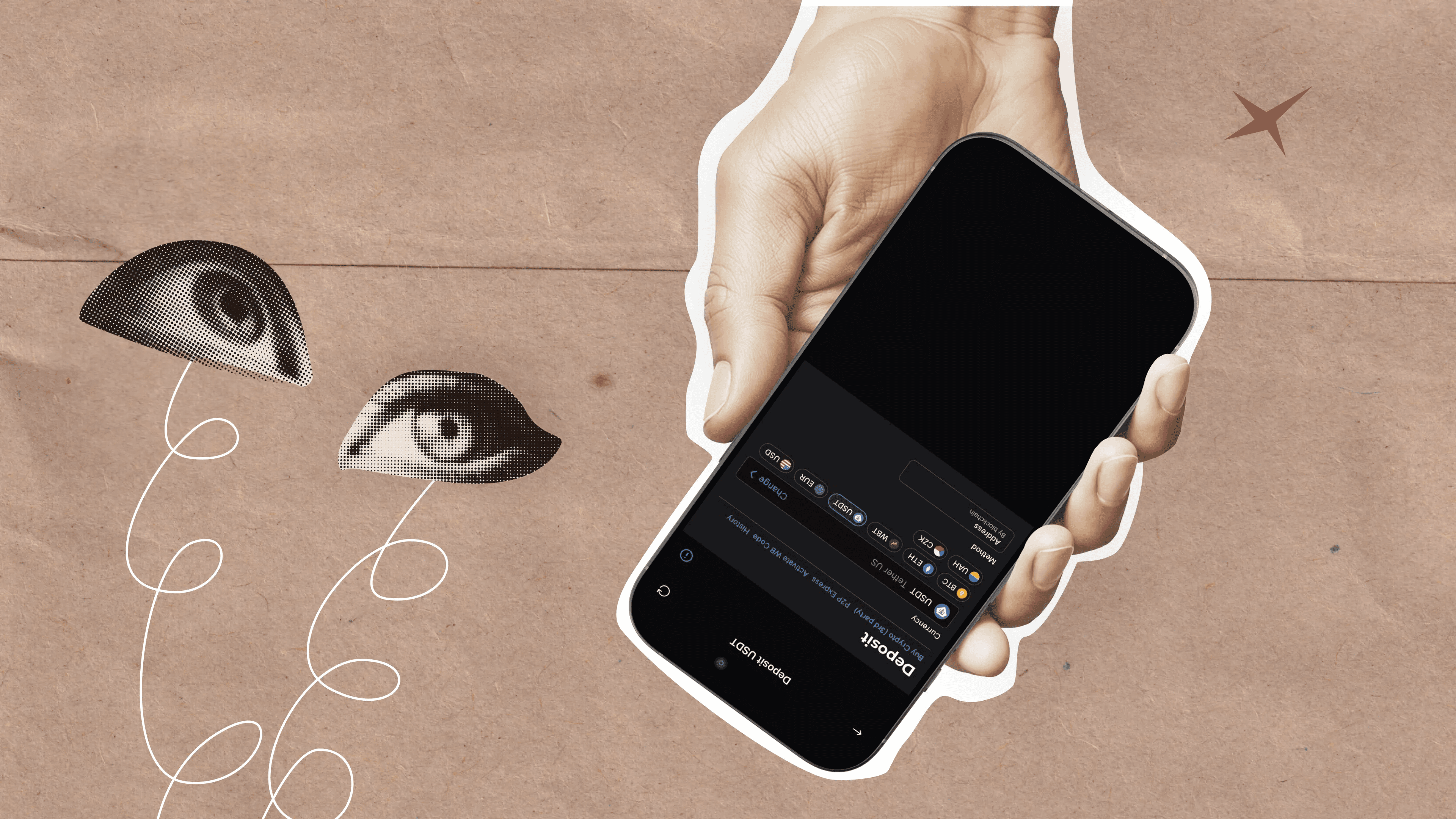
Research shows that if users can’t find what they need within the first few seconds of landing on a site, they’re much more likely to leave — often without scrolling or reading anything at all.
This means the first screen should not be an introduction, but a clear and confident signal of value and trust right away.
This is especially true for utility products: fintech, energy, healthcare, education.
Users don’t come to explore. They come to solve a task and get out.

When attention is measured in seconds, hierarchy becomes survival. Users scan before they read. And often, they never read at all.
If everything looks equally important, nothing is. If the eye doesn’t know where to land — the session is over. At this point, hierarchy is no longer about aesthetics.
It’s about reducing cognitive load as fast as possible.
What felt acceptable five years ago now feels exhausting.
Extra steps. Unclear labels. Over-explained flows.
Even small UX gaps become much more noticeable when attention is limited. They don’t just slow users down — they push them away.
I wrote about this earlier while analyzing fintech products: how products rarely fail because of big decisions, but because of tiny UX gaps hidden inside everyday flows.
Fintech products don't fail because of big decisions, but because of tiny UX gaps hidden inside
When attention becomes scarce, designers stop being “interface makers”.
We become:
• editors
• prioritization partners
• guardians of cognitive load
Good design today is often about deciding what not to show. Not because users can’t handle complexity — but because they shouldn’t have to.
Short attention span is not something that will “go away”. It’s the environment we design in now.
Designing for it doesn’t mean oversimplifying products or dumbing them down. It means respecting users’ time, energy, and mental space.
And honestly — once you start designing with that mindset, it becomes very hard to go back.