Product structure · UX & content · Visual design · Build & setup
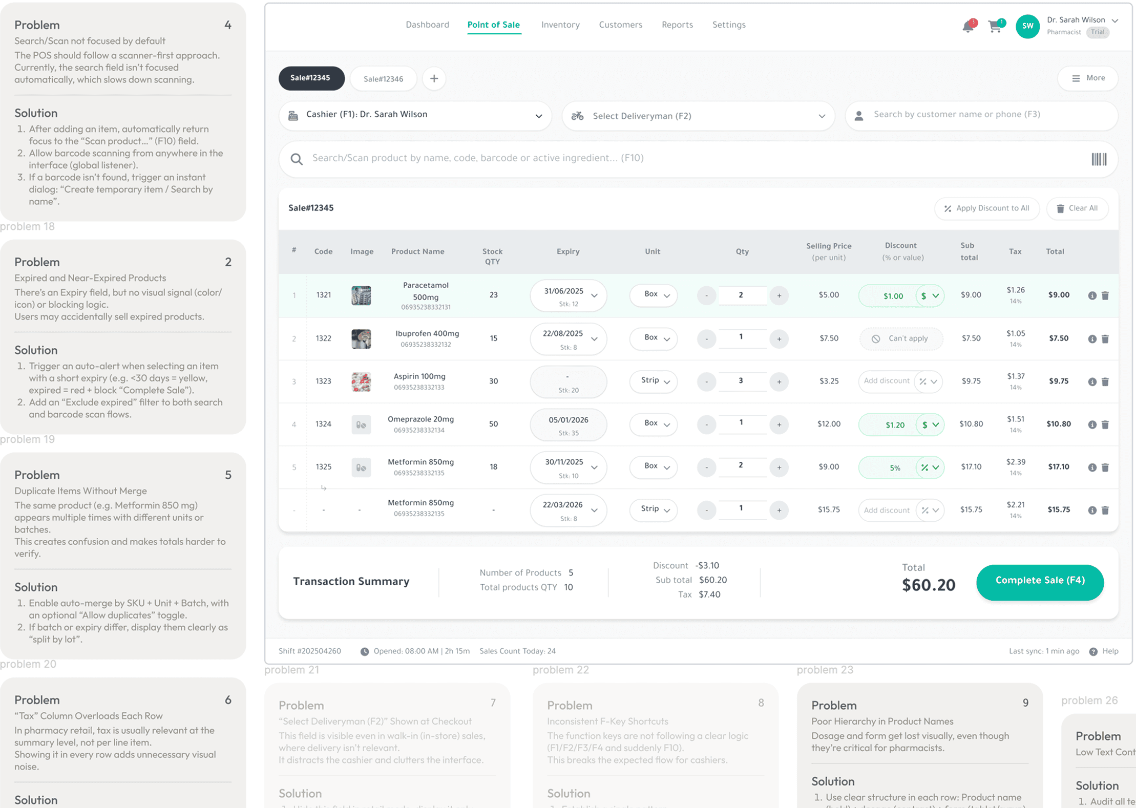
Role
Website · Course pages · Checkout · Course access
Scope
The brief
Dr. Bilenko had years of expertise and several courses ready to launch. My job was to turn all of that into a clear, working experience — one that explains the offer, builds trust and takes students from the first visit to course access.


Product structure
I organised the courses, bundles and supporting content so the offer was easy to understand — and the right option easy to choose.
Design & build
I created the visual system, designed the responsive pages and built the final site in Framer.
Course platform
I chose and set up the course platform, then connected payment to post-purchase access.
Designing the journey
Three decisions shaped the experience.
Task
Several courses, bundles and learning formats had to feel simple to understand, compare and buy.

Kseniia Bator
Product & Web Designer
Solution
01
Make the offer easy to understand
Solution
03
Build trust before asking people to buy
Solution
02
Keep the purchase flow simple

Details are part of the product
A lot of the work happened in small decisions: how the courses are compared, where key information appears, what each button says and how it behaves. None of them is dramatic on its own, but together they make the site feel clear and obvious to use.

Explained who each course is for
Made course differences easy to scan
Showed programmes without overwhelming the page
Placed key details where people needed them
Made price and format easy to find
Kept buttons and actions consistent across the site
Connected pages into one clear journey
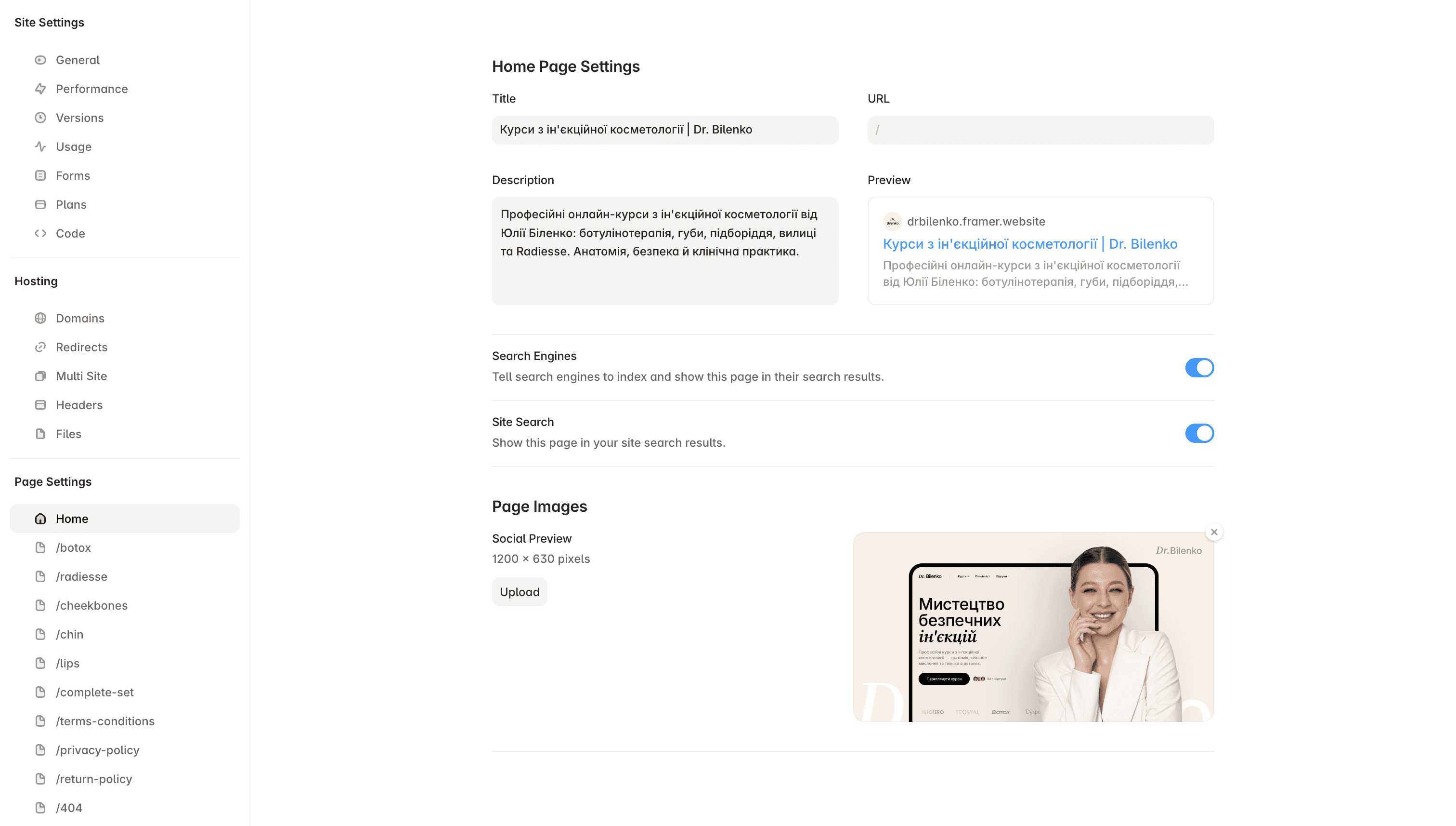

Built responsive layouts in Framer
Connected checkout to course access
Tested the small interactions that make the experience feel finished
Designed — and actually shipped.
I built the site in Framer, adapted every page for mobile, connected checkout and set up the course platform. The result is one continuous flow: choose a course, pay and get access.
The site keeps the character of Dr. Bilenko’s Instagram, but gives the courses a clearer structure and a much simpler path to purchase.

Yuliia Bilenko
Course creator

The result
The result is a working course website, not just a set of designed pages: people can understand the offer, choose a course, pay and get access in one connected flow.
6 course offers
€199–796 price range
Website →
Payment →
Access
Kseniia Bator
Product & Web Designer