
Guidelines are essentially a set of rules created by platform holders to maintain order in their ecosystem.
They are built to:
Prevent terrible design decisions.
Stop new users from getting confused or scared.
Ensure the interface is “average,” “safe,” and uniform.
In my ~8 years of designing interfaces across fintech, SaaS, and mobile products, I haven’t shipped a single app that followed the guidelines 100%. Unless you work at Apple or Google, you shouldn’t either. (fun fact: even they break their own rules all the time).
Why? Because “Native” does not always mean “Best.”
Take the native Android Date Picker, for example. It is “correct” according to Material Design. But for many specific tasks — like selecting a flight range or entering a date of birth — it can be clunky, requiring too many taps. If you prioritize the guideline over the user’s time, you fail the UX test.
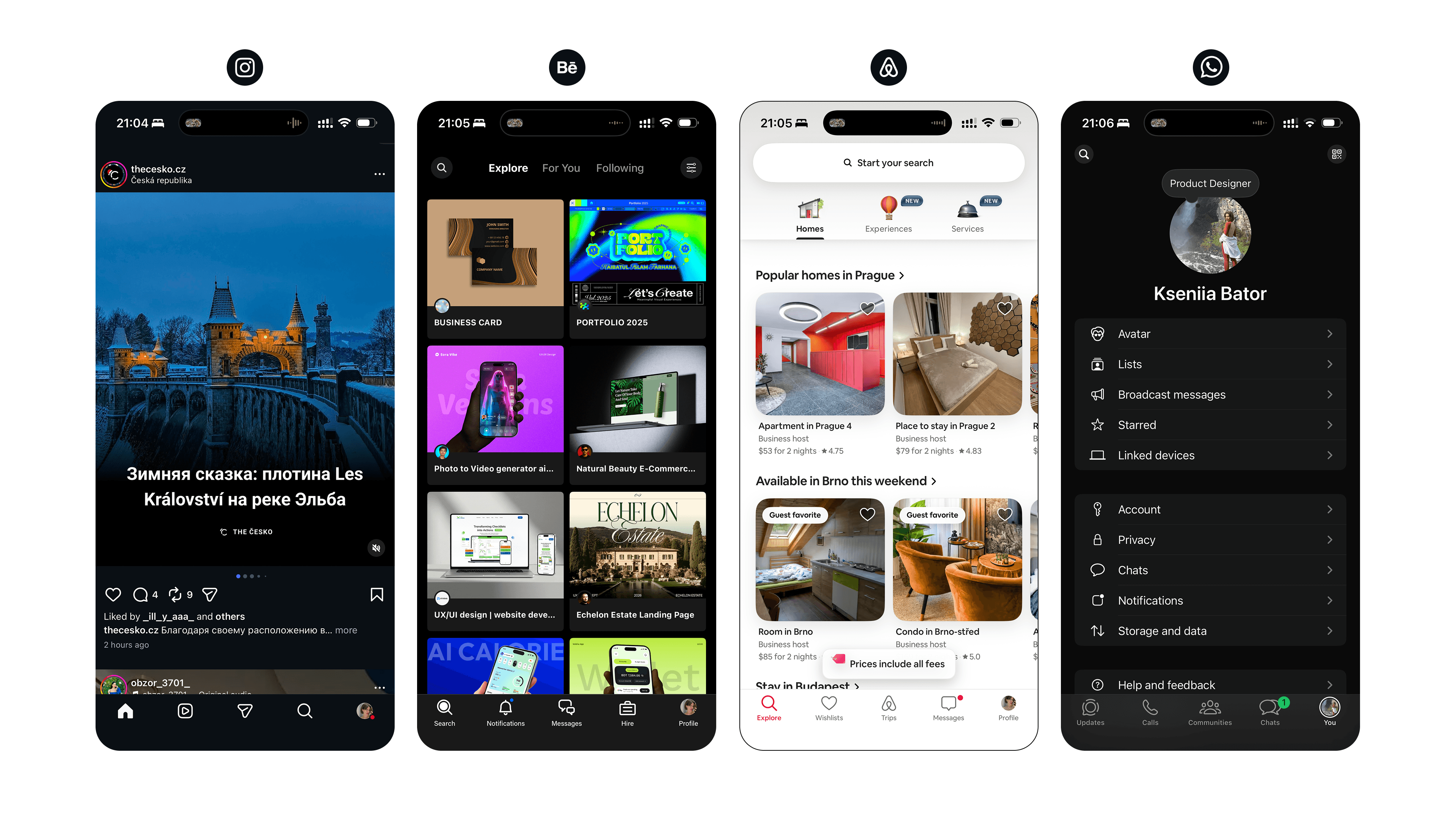
This topic came to mind recently when I saw the new Telegram for Android beta.
Historically, Android apps strive to look like Android apps. But Telegram is doing something interesting: they are ditching strict Material Design in favor of iOS-like aesthetics — reconstructing “liquid glass” blurs and transparency effects as much as Android allows.
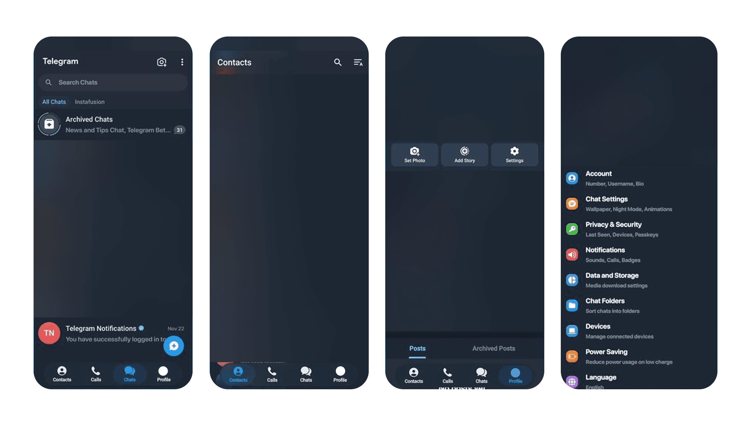
Why would they do that?
Because Cross-Platform Brand Experience often beats Platform Consistency.
Telegram wants its users to feel like they are using Telegram, not just “another Android messaging app.” They are prioritizing their own physics, their own emotions, and their own visual language. They are building a universe inside the OS.
This topic came to mind recently when I saw the new Telegram for Android beta.
To break the rules effectively, you need to know them first. Here is where I draw the line:
Respect the Mental Models (Don’t Break These):
Navigation Logic: Don’t mess with how users go “Back” or return “Home.”
Tap Targets: Don’t make buttons smaller than 44px just because it looks “sleek.”
Fundamental Gestures: Swipe to delete, pull to refresh. These are muscle memory.
Ignore the Dogma (Do Break These):
Visual Styling: If your brand is bold, don’t use the default system blue just to be “safe.”
Standard Components: If a custom control saves the user 3 clicks, build the custom control.
The “Vibe”: If the guideline says “flat and material,” but your product needs “depth and glass” to convey quality — trust your product vision.
Guidelines are a floor, not a ceiling. They prevent you from making a bad interface, but they won’t help you create an exceptional one.
Your job as a designer isn’t to be a compliance officer for Apple or Google. Your job is to advocate for your user. Sometimes, that means taking the guidelines, saying “thank you,” and then doing exactly what your product needs instead.