We all love those before-and-after mockups — the ones that make the new version look more modern, balanced, “alive.”
But numbers don’t lie: sometimes a more elegant interface performs worse, and sometimes a rough MVP unexpectedly outperforms a polished concept.
So how do you know when design worked?
Over time, I’ve learned to look at three types of signals: numbers, feedback, and observation.
This piece is about the first one — numbers.

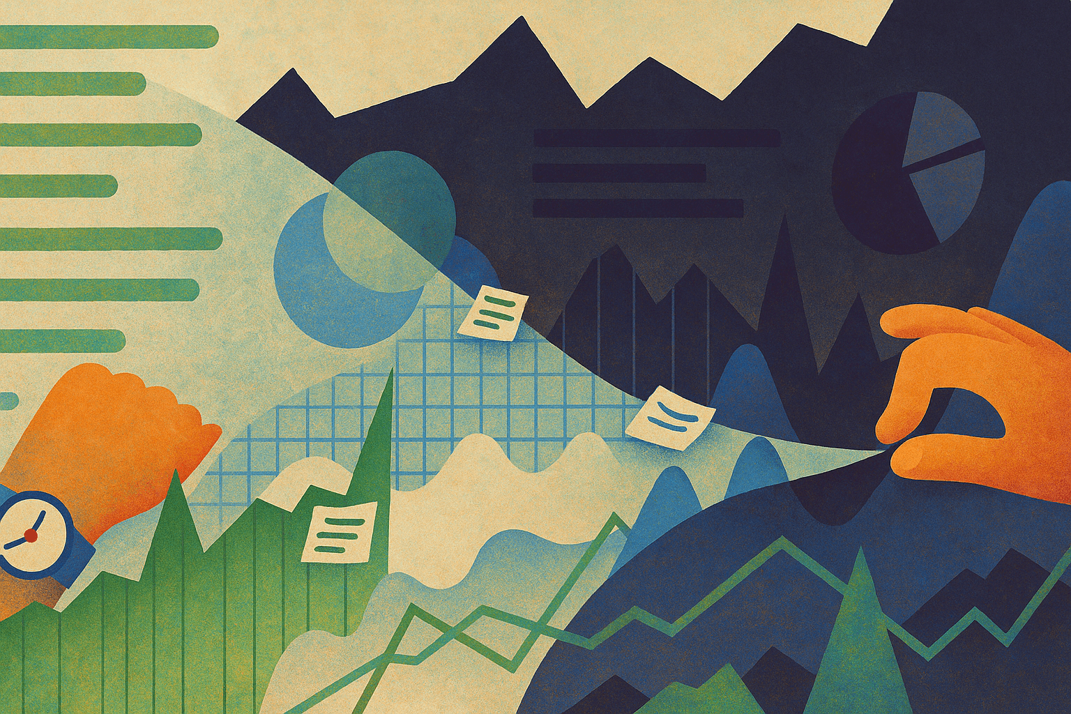
Metrics aren’t just charts or dashboards — they’re coordinates.
They show where the product is heading and whether design decisions are moving it forward or sideways.
But not all metrics are created equal.
In most products, there are two levels:
Health metrics — show how the product lives overall: revenue, active users, CAC, LTV, retention.
They reflect the sum of everyone’s work — design, marketing, operations, timing, even the weather.
Design metrics — show how a specific design decision affected behaviour: conversion rate, time on task, scroll depth, error rate, drop-off between steps.
Even small interface decisions can create measurable business impact —
especially in conversion-heavy flows like checkout or onboarding.
Baymard Institute’s long-term UX benchmark found that the average checkout flow still loses around 35% of potential conversions due to usability issues.
In other words, fixing design friction is not “aesthetic improvement” — it’s revenue recovery.
Designers rarely influence revenue directly,
but we often influence what happens right before it —
how fast users find value, how clear the next step feels, how confident they are when they click “Buy.”
That’s the difference between a pretty design and a working one.

One of the hardest parts of measuring design impact is separating the effect from everything else happening around.
Imagine you redesigned a checkout flow, and the next month conversions grew by 20%.
It feels like success — but what if that spike came from a seasonal sale or a Halloween pumpkin discount campaign?
Interestingly, Nielsen Norman Group analysed 99 UX case studies and found that the average measurable gain from UX improvements dropped from +247% in 2006 to around +75% today.
The better our products become, the harder it is to see big jumps — which makes precise measurement and context more important than ever.
The truth is, design rarely works in a vacuum.
To understand the real effect, we have to connect what exactly changed and who it affected.
That’s why I no longer celebrate a single number.
I look for a story in the data:
What was the baseline?
What changed in user behaviour?
What stayed stable despite the change?
When you find a pattern that points directly to design — that’s when it becomes evidence, not coincidence.
Sometimes there’s no analytics setup at all.
No events, no dashboards, no way to measure impact.
It’s frustrating — but not hopeless.
Here’s what helped me in such situations:
Negotiate tracking. Ask developers to add a few key events. Even two or three can reveal a lot.
Use research as a proxy. Quantitative surveys or usability tests can show conversion, time, or completion rates.
Listen to support. Sometimes customer tickets or reviews give a better signal of change than dashboards.
And if the team still doesn’t care about measuring —
maybe it’s not the right place for a designer who values learning.
Designers often struggle to show results.
We write “increased conversion by 30%,” and it sounds impressive — until someone asks, how exactly?
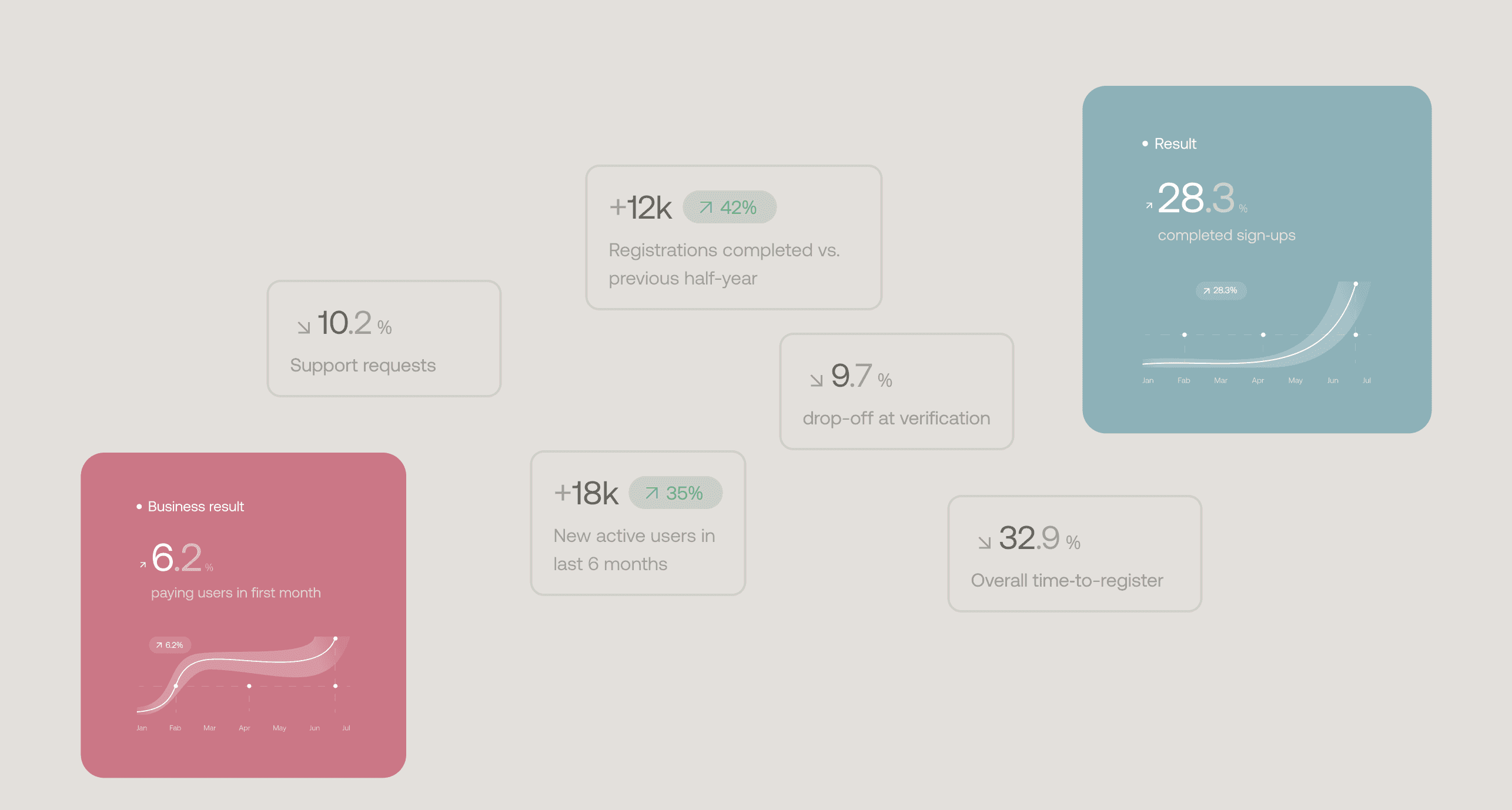
Instead of vanity numbers, it’s better to show the chain of influence:
Design change → Local metric → Key metric → Business outcome
For example:
Simplified checkout steps → 17% fewer drop-offs → higher completed orders → +8% monthly revenue
That’s the kind of story that tells both what you did and why it mattered.
I don’t believe design ever stops being a learning process.
Even when you know how to measure impact — you keep refining how to read it, interpret it, and communicate it.
That’s the beauty of it: staying curious, analytical, and grounded at the same time.
Because when you finally trace that quiet, clear connection —
from a design decision to a real change in behaviour —
you feel it.
That’s when design truly works.
And that’s beautiful work.